You’re not the only business owner or web designer who finds it difficult to come up with color schemes for websites. Even though selecting colors may seem intuitive, good color palettes need a lot of strategy.
Everyone has personal preferences for various hues; some people lean toward muted pastels while others favor strong hues like cherry red and neon green. There are no wrong colors for websites, but to make wiser color selections, web designers must overcome their own biases and those of their clients.
Fortunately, there are a few guidelines and techniques that make selecting web design colors a simpler task. In this blog, we’ll show you how to eliminate uncertainty when selecting colors for your web design projects based on every rule in the book.

1. Why Web Design Colors Matter
First things first, whether the material is at least readable depends on the web design colors chosen. The text and background should be sufficiently contrasted for legibility. While too much contrast strains the eyes, too little contrast makes the text difficult to read.
The traditional illustration of web design colors contrast is white backdrop with black writing. Many websites actually employ dark gray text on a white or off-white backdrop to improve legibility while minimizing eye strain, as you’ll see if you pay close attention.
Next, we wouldn’t be talking about arbitrary web design colors preferences when valuing visual appeal in the website. Instead, the focus is on developing aesthetically pleasing web design colors schemes. You need to be making color selections that appeal to a wide audience.

Brand recognition is another crucial function of web design colors. Many brands have one or more primary colors that are prominently used on their website, promotional materials, and other brand assets. To establish brand awareness through color, consistency is essential.
2. Are You Missing Out On Color Theory
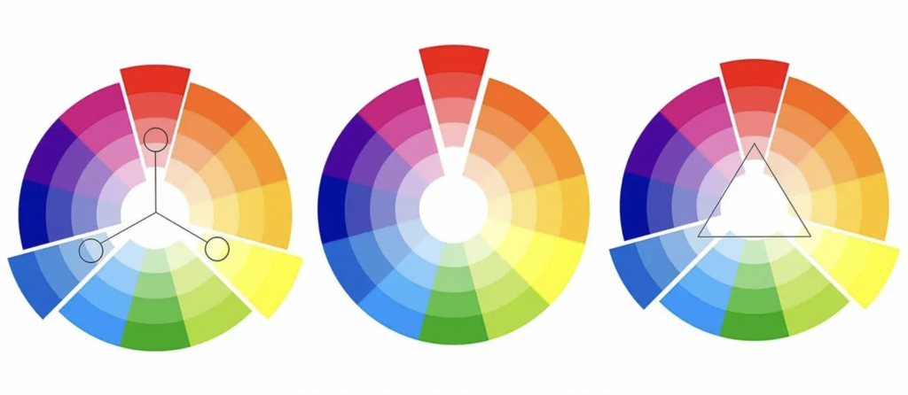
A useful framework for choosing the complementary web design colors we’re stressing on is provided by color theory. The color wheel, which graphically illustrates the relationships between various hues, is the central element of color theory.

Primary, secondary, and tertiary colors are represented on the color wheel. Additionally, it can be separated into warm and cold hues. Finding harmonious color combinations begins with becoming familiar with the color wheel.
The primary color is the greatest place to start when making a web design colors palette. The main color in a palette is the focal point. According to the 60-30-10 rule, a website’s primary color comprises around 60% of all other colors.
3. There Are Color Themes Too
A color scheme is a tasteful arrangement of hues. Monochromatic, complimentary, and analogous color schemes are the three basic categories of color schemes that web designers should be aware of. You might consider these schemes as a kind of color palette template. Let’s examine each in greater depth.

Web design colors schemes that are monochromatic are based on one hue. Primary and secondary colors like red, yellow, and green are examples of hues. Pick a color, like blue, and utilize shades, tones, and tints to blend it into a unified palette to create a monochromatic color scheme. The visual appeal of monochromatic hues is assured, but special care is needed to ensure sufficient contrast for intelligibility.
Colors at the opposite ends of the color wheel make up the complementary web design colors schemes, red and green or blue and orange, for instance. Complementary colors are frequently used in web design because they typically contrast nicely. To avoid the colors being overly distracting, the contrast should be used intentionally because it can be startling.
On the other side of the spectrum, colors that are close to one another on the color wheel are used to create analogous web design colors schemes. Although these color combinations are naturally beautiful, like with monochromatic color combinations, take care to make adequate contrast for intelligibility. Use a neutral hue, such black or white, with an analogous color scheme to increase readability on a website.
4. From Another Perspective: Color Psychology
Color psychology deals with the sensations and emotions that various colors generate, as opposed to color theory, which is focused on developing harmonious color schemes. Although they may seem nebulous in a corporate setting, feelings and emotions are crucial to branding, marketing, and sales. In actuality, a consumer’s decision making process is driven largely by emotions.
Consideration of basic color meanings is one technique to use color psychology when selecting web design colors. Different colors can intentionally or unconsciously evoke particular emotions. These emotions are significantly influenced by both cultural circumstances and individual experiences.
Here are a few instances of typical web design colors associations.
- Red denotes passion, strength, love, danger, and excitement
- Blue reflects tranquility, competence, calm, reasoning, and dependability
- Green symbolizes plenty, nature, and good health
- Yellow is all about joy, optimism, creativity, and friendship
- Orange connotes enjoyment, freedom, coziness, and playfulness
- Purple represents luxury, mystery, sophistication, faithfulness, and inventiveness
- Pink is a symbol of warmth, tenderness, and care
- Brown reminds us of nature, safety, security, and support
- Black represents sophistication, power, control, and despair
- White is the icon of cleanliness, tranquility, and purity.
Contradictory meanings for several colors can be seen. For instance, red can signify love and passion as well as danger, as it frequently does. Black can incite sentiments of power or despair depending on the situation. Here, context is crucial.
When selecting web design colors for a brand or website, context is an important factor to keep in mind. The use of red on a website doesn’t necessarily indicate danger, just as it doesn’t necessarily indicate love. The typeface, images, and messaging, along with the other page elements, all work together to create a specific look and feel.
5. Trending In 2023
Earthy Tones
Earthy browns, avocado greens, mustard yellows, and harvest golds are taking center stage as designers look back to the calm and cool color palette of the 1970s for inspiration.

Such earthy tones help ground website visitors by evoking a sense of warmth, familiarity, and approachability as well as a happy longing for a simpler period.
Acidic Colors
Colors that damage your eyes are included in the acidic color palette in addition to bright, sharp hues, in the most aesthetically pleasing meaning. The hue becomes brighter the more acidic the substance is.

Until dramatic and vivid hues draw your attention in a way that is completely at odds with the soft aesthetics of the ’70s color movement. The acidic color scheme is most definitely the solution if you want your web design to stand out from the crowd.
Silvers
The silver chrome color trend goes in wonderfully with the moodiness and gloomy uneasiness of the graphic design trend of acid graphics. With its warped, melted metallic appearance, this web design trend is all about challenging the established quo.
The color of silver itself can be anything from a dark, flat tone to a bright metal. Since this color trend is less about promoting beauty for the sake of beauty and more for encouraging anti-establishment expression and challenging norms, it blends well with nearby styles like acid graphics and anti-design.
Sci-Fi Themes
Dark science fiction themes present us with web designs much more somber and ominous. The darker aspect of today’s world, one dominated by technical breakthroughs that seem to entrap us rather than free us, is reflected in the dark sci-fi web design color trend, which is at its core a mirror to that darker side of modern life. Darker times call for darker color trends.
Pantone’s Color Of The Year
Last on our trends list is the color Viva Magenta, Pantone’s Color of the year. It’s a fearless and tenacious shade that is paving the way for a hopeful future. It happens when we adjust to life after a pandemic, investigate a new technological era, and deal with a growing sense of unease and worry caused by economic instability, international conflicts, and climate change.
Using color schemes from a different era as an escape, embracing bright colors for a positive outlook, or engulfing in dark hues as a representation of darker times are just a few of the ways that the color trends of 2023 are all about finding brights and shadows in today’s society. These color trends provide you room for expression, at least within your web design.
So, have you rethought your web design’s color palette this year yet?
Contact TeckYou experts, this time, for a free consultation with a splash of colors.


