12 to 24 million is the estimated number of ecommerce websites in the world today.
While you might see this number reflecting the most legendary business battlefield our world has ever witnessed, we see it as a huge guaranteed potential for your business success; you just have to do your ecommerce website the right way.
Certain elements are essential to every ecommerce website to stay relevant, stand out among competitors, and eventually generate high revenues. Lucky you, we live in this age when most consumers already have their online shopping experience.
So, your ecommerce website shouldn’t reinvent the wheel. It just needs a regular reflection every once in a while to add essential elements, features, and trends. Oh, and you could always listen to your customers’ feedback to drive your upgrade from there.
We’ll take you on a shortcut to your ecommerce website upgrade with 10 essential elements you need to add. Grab a pen and a paper and let’s go through a checklist of 10 ecommerce satisfaction elements.
Mobile Navigation
Having a mobile-friendly web design is one thing, but developing your own shop’s mobile app is a whole different level. All stats today beg you to operate even the most basic smartphone application to peacefully exist and passively sell on every device.
All stats?
Yes, here you go:
- 79% of smartphone users made their purchases using their device only between August 2021 and February 2022,
- 40% of all eCommerce purchases during 2018 holiday season were made using a smartphone,
- 80% of shoppers use their smartphones inside of a physical store to look up product reviews, compare prices, or find alternative store locations,
And 100% of users who will download your app will have your brand on their mind every time they hold their phone and see your eye-catching logo. That’s not to mention the attention you’ll get with every app update or notification appearing on their home screens.
Product Menu
You know what else your customers would love to see?
That would be a clear product menu for easy website navigation.
Your product menu is the first step towards helping your ecommerce website visitors find relevant products and make purchases. This 100% profitability starts with prospects genuinely looking for the right product. You wouldn’t want to make them lost nor lose them during the process.
It is a crucial ecommerce web design element whether you’re just launching your first website or rethinking your old one. In the second case scenario, you might have added products to your inventory or monitored your customers’ navigation. So, there’s always a chance for an updated product menu with logical categories and popular listings.
One way to do a perfect navigation bar even for the largest online stores is sorting out your products by categories. The trick here is to find every individual item with not more than three clicks and without long scrolling. A category-based menu is always attractive and totally functional to present your brand in the most alluring way.

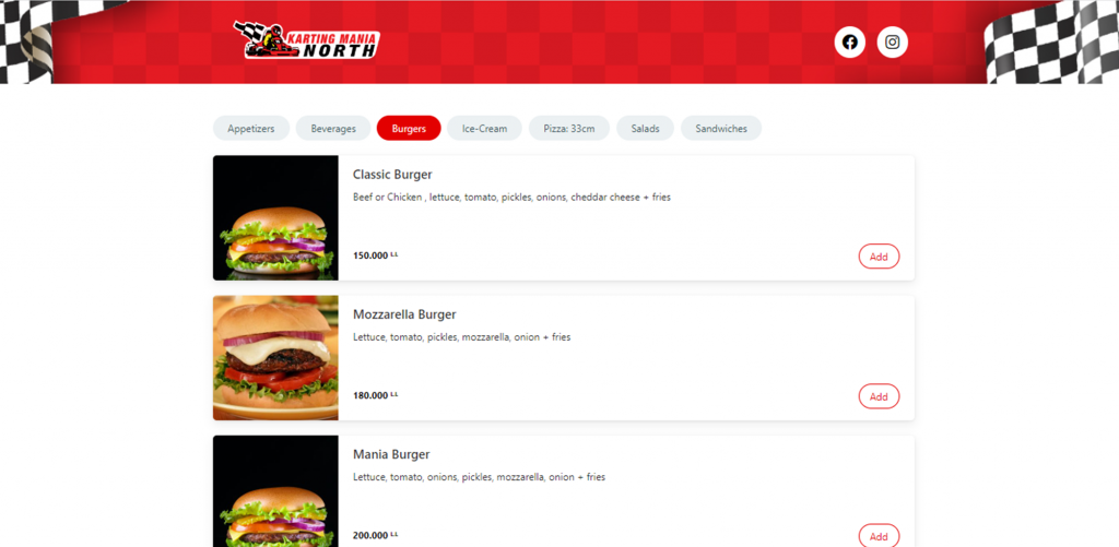
Here’s the example of Go Chic fashion website that went for a structured, vertically oriented menu. Karting Mania North went for a horizontally oriented one with extra popping colors and zero scrolling. Our web designers team will always amaze you when it comes to customized menus.

Clickable Products
So, they found the products, they scrolled through the different options, and they made a purchase decision… Your products need to all be clickable at this point!
Customers, at least the majority of them, will need to review the details of the product before they hit that add to cart button. Your online shop is expected to give them the option to view product attributes such as size, color, or any other variable to help them make the final decision and avoid completing an order by mistake.
Make sure that both the featured product image as well as the product name are clickable. Inside, ensure that you itemize every product detail including the price, shipping details, description, and drop-down menu for variable sizes or options available. Remember the checkout button too.
Descriptions
Diving into the product description, this one should simply tell to sell.
When building your ecommerce website, product descriptions might be one of the last elements you think of, but they shouldn’t be. The best ecommerce content presents quality product descriptions that preserve your brand identity, tell your story, and show your authenticity in every word, tone, and syntax.
You need your descriptions to be complete and informative, never missing details nor causing confusion. You would also want to speak your customers’ language and optimize yours for search engines to get maximum online visibility and record-high conversion rates.
Visuals
Since you’re all about conversions, your product pages definitely require quality product photos and videos to increase conversions. The visual aspects of your ecommerce website will be the first thing that wins your visitors’ attention and influences their impression about your brand.
Next, a real quality visual presenting your product plays a crucial role in actually buying the product or discarding it. It’s one of the most decisive elements you must take close care of in your ecommerce website. There’s also lots of potential to level up your visuals to feature a product’s instructions and uses.
Your product visuals can tell more about you, how passionate you are about your business, how much effort you deploy for it, how dedicated you are, and how professional you deal with your customers. Visuals are a glimpse into a whole customer journey from the first sight.
Easy Checkout
Also part of the journey is the checkout. An easy checkout process isn’t just something consumers desire, they demand it. Look at this, 87% of online shoppers will abandon their carts if the checkout process is complex and 55% will abandon the retailer completely.
Rethink your checkout experience to be as simple and frictionless as possible with straight forward functions and leveraged technology integration. These include a one-click checkout, accurate costs, clear display, automatic fillment of information, and custom options.
You may want to consider offering numerous payment options such as credit cards, Apple Pay, or cash on delivery. It is indeed one step closer towards completing a successful sale without hesitation nor pain of paying. When even the most basic ecommerce platforms offer easy checkouts, you can’t have an excuse to explain your complex one. Our experts would gladly assist you on this one.
Coupon Code
Did you know that consumers search for coupon codes on Google when presented with a coupon or discount box on a checkout page?
It happens so much that in the US, 88% of consumers use coupons when shopping. And where do they get these coupons from?
They resort to coupon sites like slickdeals.com, groupon.com, and retailmenot.com.
But, your ecommerce website isn’t on there, isn’t it?

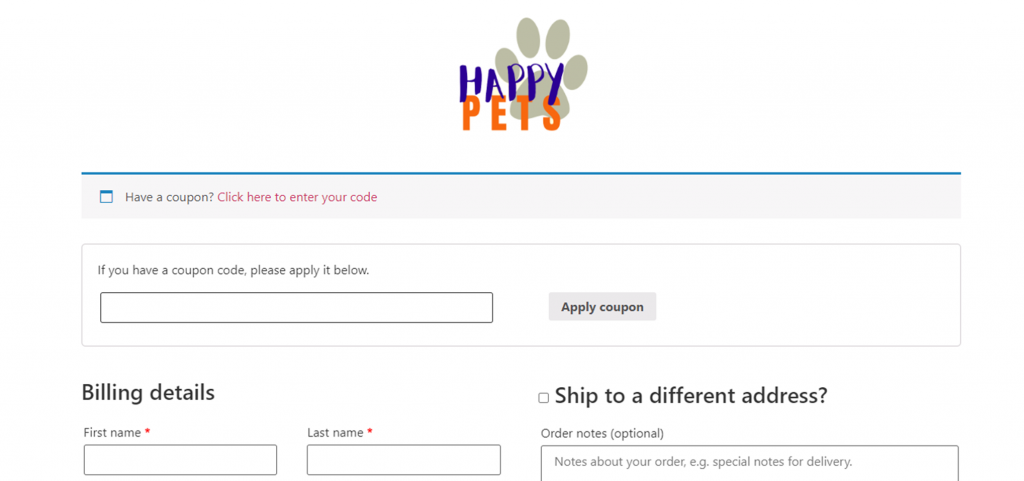
So, simply, make your own coupon codes regularly. It all goes back to the pain of paying and trying to resist this feeling until you sell. If your goal is to hold on to your customers on your ecommerce website throughout the checkout process, then offer them exceptional deals using your own coupon codes.
Clear Policy
Your policy is yours to craft as well. Privacy, shipping, and return policies are a critical part of any website’s legal framework and should be made a top priority. These will, first and foremost, present your business as credible. Then, they will protect you as an ecommerce company in terms of addressing misunderstandings and potential lawsuits.
A transparent, compliant, and easily accessible policy section is what your customers expect from your ecommerce website when buying any of your products, especially the first few times. Expectations, decisions, and accountability will all be spelled out clearly and managed hustle-free through your site’s policies.
What an uplifting relief right!
Ecommerce Email
Your policies won’t be the only form you communicate to your customers with. You can inform them about policy updates, new products, seasonal sales, or exciting trends through ecommerce emails. You would be hooked on this once you know that ecommerce emails hold a revenue-generating potential.
If your visitors left your ecommerce website without making a purchase, your next best conversion choice for your store would be to attain the visitor as a subscriber on your email list. Emails sent by ecommerce businesses usually have an average open rate of 15.68% and a click rate of 2.01%.
Now, how would you reach email subscribers?
The answer is…
Push Notifications
To capture your ecommerce store visitors as subscribers you will need push notifications. The service does more though. Notifications increase your ecommerce website’s traffic and enable higher conversions. All notifications from your end are delivered to your users’ notification center via their browser even when they’re not browsing your site.
Your ecommerce website can be more than just an online shop. You can, and you should, make it a pleasant customer journey that starts from filling your business’ gaps and ends with impactful experiences marked by your signature products.
Whether you need an entire ecommerce website with multiple pages and advanced options, or a customized single page online shop like Quickshop, you can trust TeckYou services to make it happen for your business. We’ll do the rethinking with you and add your 10 essential elements.


